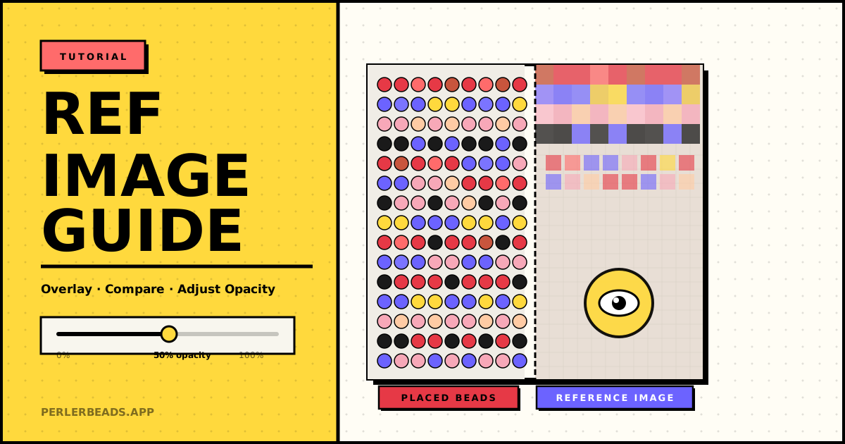
One of the hardest parts of working from a pattern is constantly glancing between your reference image and the board. You lose your place. Colors look different at a distance. That pink looks right — until you step back.
Perlerbeads Studio has a feature that solves this: reference image overlay. Instead of a side-by-side comparison, the source image is projected directly onto the grid, right behind your beads. Here's how to get the most out of it.
Step 1: Upload Your Reference Image
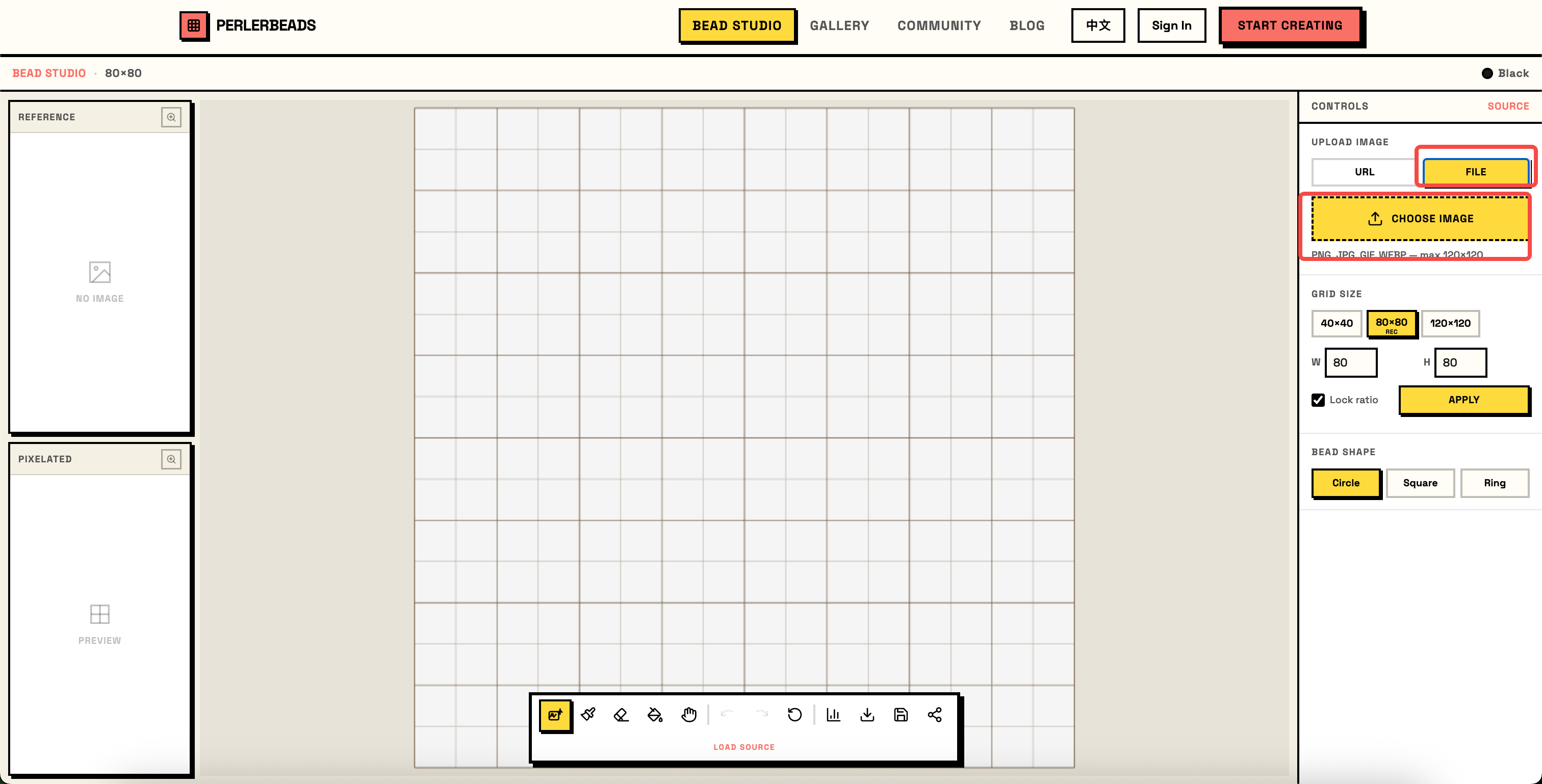
Open the Studio and click UPLOAD IMAGE in the right panel. You can upload from your device or paste a URL. Supported formats: PNG, JPG, GIF, WEBP — up to 120×120 grids.
Once uploaded:
- The REFERENCE panel (top-left) shows the original image thumbnail.
- The PIXELATED panel (bottom-left) shows the auto-converted bead pattern preview.
- The canvas switches to PAINT mode, ready for manual touchups.
The reference image is now overlaid on the grid, scaled to fit perfectly within your canvas area.
Step 2: Use the Overlay to Guide Color Placement
With the overlay active, each grid cell shows the underlying reference color through the beads. This lets you:
- Immediately see which bead color best matches each zone of the image
- Catch mismatches early — if a placed bead looks obviously wrong against the reference, you'll see it at a glance
- Work faster — no more constantly referring to a separate image window
Tip: The pixelated preview in the bottom-left panel already gives you the closest bead colors for each cell. Use the overlay as a second opinion when you're unsure.
Step 3: Erase Half and Compare
Here's the most powerful technique: use the Eraser tool to clear a section of beads, exposing the raw reference image beneath. Then place beads back one by one, comparing each bead directly against the pixel color it's covering.
This "erase half, compare half" method is especially useful for:
- Skin tones and gradients — where the difference between two similar bead colors is subtle
- Complex backgrounds — when you want to verify a large area before committing
- Fixing mistakes — clear a region and re-examine the reference before re-placing
How to do it:
- Select the Eraser tool from the toolbar
- Drag across the area you want to re-examine — the reference image is revealed beneath
- Compare the exposed reference color with your bead color choices
- Switch back to the Pencil tool and re-place with confidence
Step 4: Adjust Opacity to Reduce Visual Interference
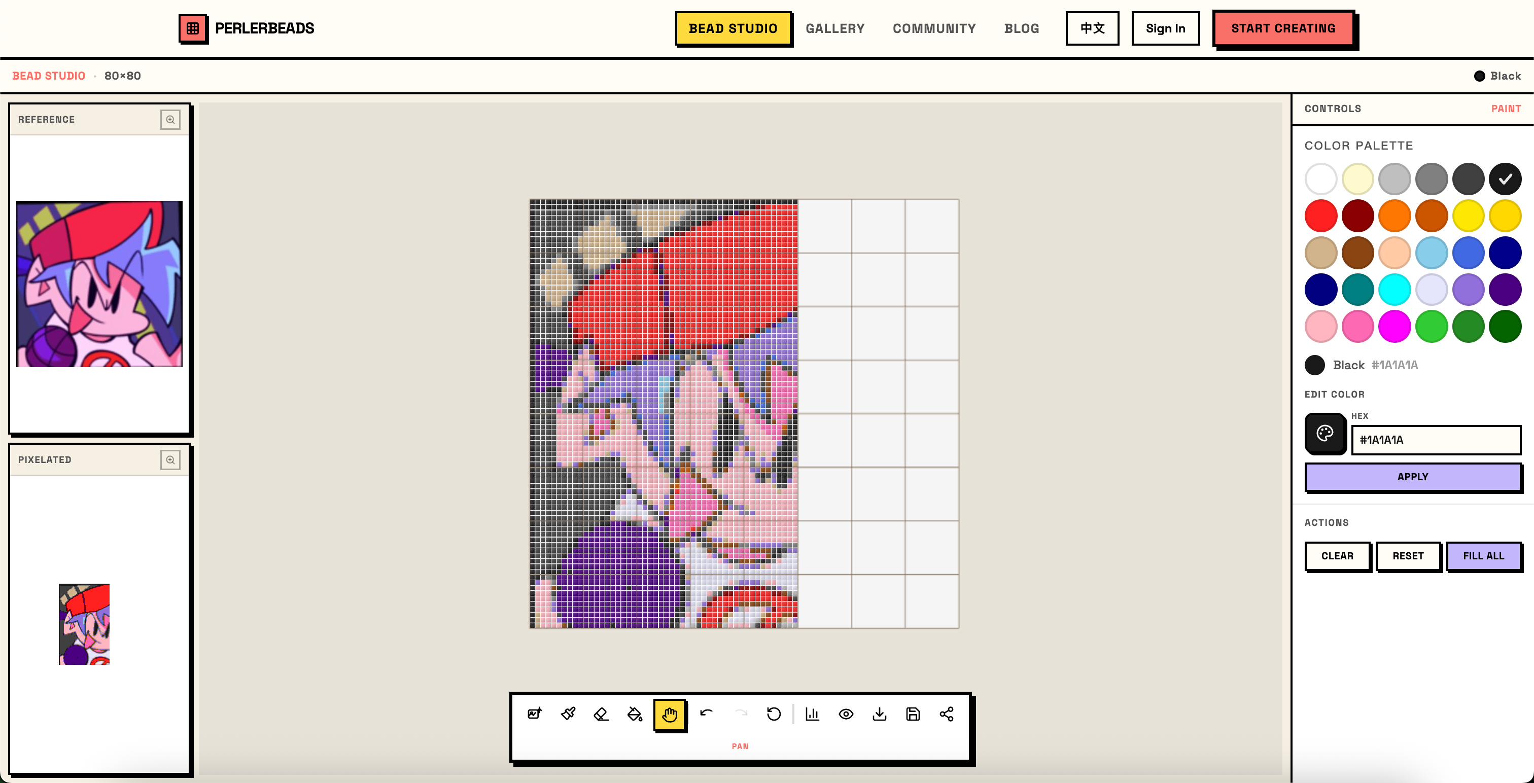
When the reference image is vivid and your beads are in progress, the overlay can feel overwhelming — too much visual noise. The opacity slider at the bottom of the canvas solves this.
- High opacity (~74%): Reference colors are clearly visible for strong color guidance. Best when starting a new section or verifying colors.
- Low opacity (~9%): The reference nearly disappears, leaving just a faint positional guide without distracting from your bead colors.
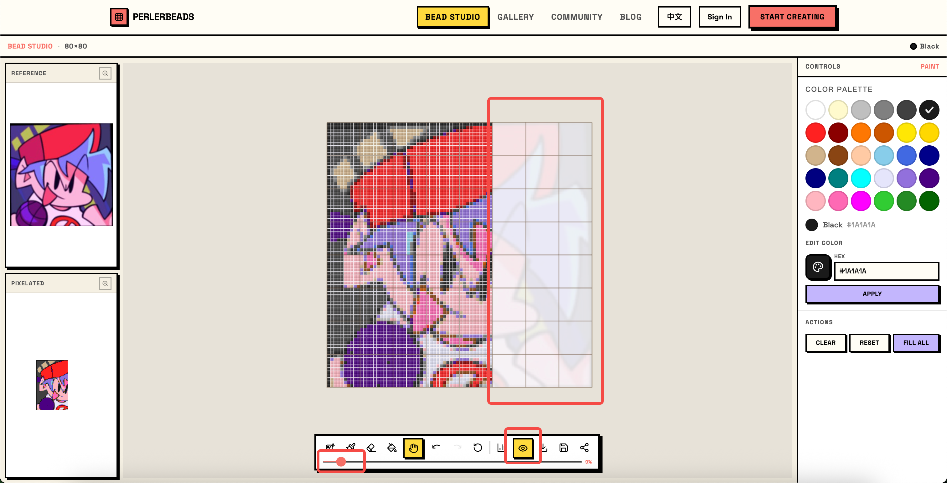
Drag the red dot on the slider left to fade the reference, right to strengthen it. Most people find 30–50% comfortable for sustained work sessions.
Once you've dialed in the right opacity, you can paint beads directly against the reference — it stays visible enough to guide color choices without drowning out the beads you've already placed.
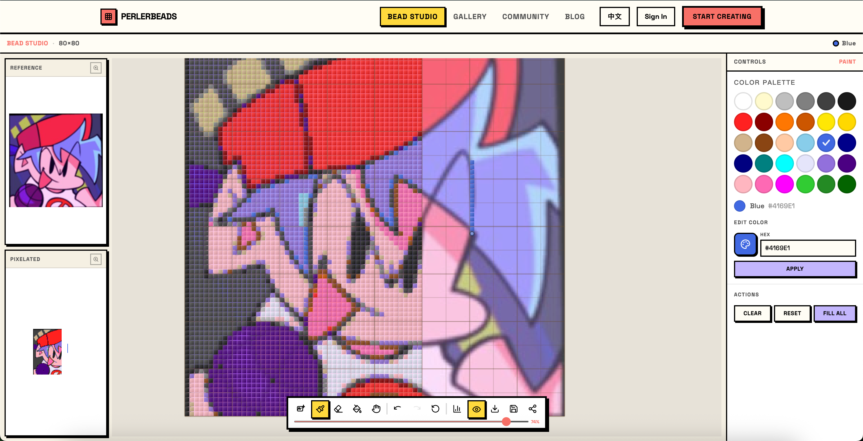
Tip: Lower opacity is especially helpful for light-colored areas like white backgrounds — at full opacity, these can wash out the bead grid entirely.
Step 5: Toggle the Overlay On and Off
The eye icon in the toolbar lets you show or hide the overlay instantly. Toggle it off when you want to see your finished beads without the reference, then back on when you resume placing.
This is useful for:
- Quick progress checks — see the bead art as it truly looks
- Sharing screenshots — hide the reference overlay for a clean photo
- Spotting color drift — sometimes turning the overlay off reveals that your chosen colors have drifted warmer or cooler than intended
Summary
| Technique | When to Use |
|---|---|
| Full overlay (100%) | Starting a new section, verifying auto-converted colors |
| Erase and compare | Subtle gradients, skin tones, fixing mistakes |
| Low opacity (10–20%) | Long work sessions, light-colored areas |
| Toggle off | Progress checks, screenshots |
The reference image overlay turns a guessing game into a guided process. Try it on your next project — especially for portraits or characters where color accuracy really matters.
Happy beading!
Thanks to User Feedback
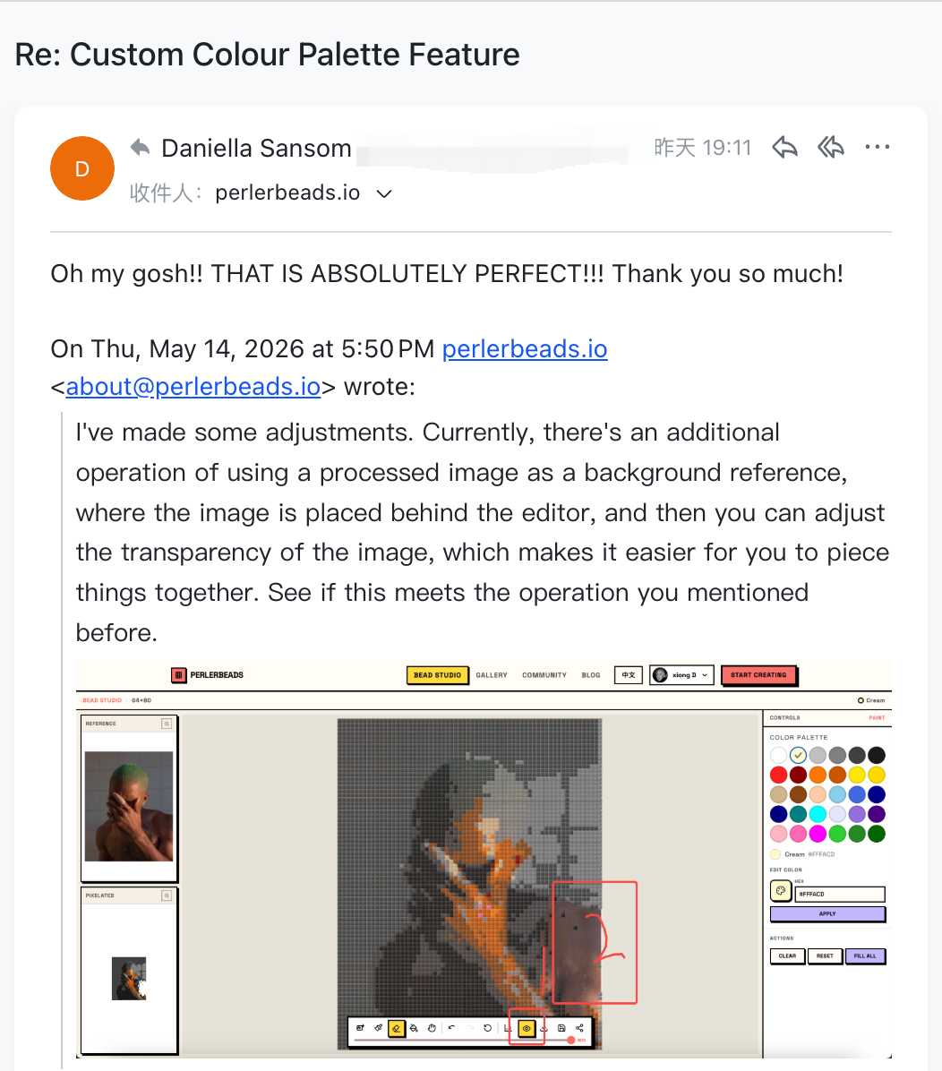
This feature exists thanks to Daniella Sansom, who suggested that the editor support placing a processed image as a background reference behind the canvas, with adjustable transparency to make color matching easier. We built and shipped it shortly after receiving her feedback — and her response made our day.
If you have ideas, feature suggestions, or run into anything while using Perlerbeads Studio, we'd love to hear from you on our contact page. Every piece of feedback is a potential seed for the next improvement — helping more bead artists bring their creative vision to life.